Table of Contents
ToggleFinal Fantasy logos aren’t just brand identifiers, they’re visual anchors that have carried a franchise spanning four decades through countless technological revolutions, platform shifts, and narrative reinventions. From the pixelated simplicity of the original 1987 title screen to the meticulously crafted emblem adorning Final Fantasy XVI’s marketing, these logos have become as recognizable to gamers as the series’ own soundtrack. Each iteration reflects not just the aesthetic capabilities of its era, but the philosophical direction of the games themselves. Whether you’re a longtime fan who remembers blowing into an NES cartridge or someone discovering the series through its modern entries, the evolution of Final Fantasy’s visual branding tells a compelling story about how gaming identities develop, adapt, and endure.
Key Takeaways
- Final Fantasy logos have evolved from simple bold typography on NES cartridges to sophisticated multi-platform visual systems, yet maintain a consistent brand identity through persistent use of crystal symbolism and refined design principles.
- The original 1987 logo’s strength came from typography alone, establishing that the Final Fantasy name itself could carry prestige and narrative grandeur without excessive ornamentation.
- Each numbered Final Fantasy entry’s logo reflects its game’s thematic identity—from Final Fantasy VII’s metallic cyberpunk aesthetic to Final Fantasy XVI’s neo-gothic brutality—making logos narrative foreshadowing tools before players experience the story.
- Final Fantasy XIV’s circular emblem design solved MMO branding challenges by functioning across global markets, esports broadcasts, and merchandise at multiple scales while maintaining franchise identity.
- Crystal elements, appearing since the earliest entries, represent the metaphysical core of Final Fantasy itself, evolving from geometric shapes to abstracted crystalline properties that communicate both worldbuilding and magical themes.
- Modern Final Fantasy logos prioritize legibility and scalability for international merchandise and digital storefronts, demonstrating that iconic brand recognition comes from simplicity and restraint rather than decorative complexity.
The Origins Of Final Fantasy Branding
When Final Fantasy first appeared on the NES in 1987, Hironobu Sakaguchi’s team wasn’t thinking about legacy, they were thinking about survival. The game’s title itself was a gamble, quite literally. Sakaguchi chose the name believing the company would close if the title didn’t succeed, making it his “final” fantasy before leaving the industry. That desperation bred clarity: the logo needed to be bold, memorable, and convey something epic.
The original NES boxart featured red block lettering against a black background, with a simple metallic quality that aligned with other premium RPG releases of the era. There was no complex symbol, no layered design, just the name itself, rendered in a way that demanded attention on crowded game store shelves. The logo’s strength came from typography alone, establishing a principle that would persist throughout Final Fantasy’s visual identity: the name itself could carry weight without excessive ornamentation.
Square’s early approach differed markedly from competitors like Enix (before the merger) and Japanese game publishers who favored mascots or character-forward imagery. Final Fantasy’s branding instead centered on a sense of prestige and narrative grandeur. The packaging suggested something more sophisticated than the cartridge war’s typical fare. This positioning proved correct, the game didn’t close Square’s doors. Instead, it opened them to a franchise that would eventually define JRPGs themselves.
The logo’s significance deepened across the NES and early SNES era. Each numbered entry maintained visual consistency while reflecting its own thematic identity through color and supporting artwork. The core typography remained recognizable, building brand equity that would prove invaluable as the series expanded.
The Legendary Numbered Series Logos
Final Fantasy I Through VI: The Classic Era
The progression from Final Fantasy I to VI showcases an evolution constrained by hardware limitations but enriched by artistic ambition. Each SNES iteration introduced subtle refinements to the logo treatment, moving toward the elaborate designs that would define later entries. The logos of this period shared a common thread: ornate lettering paired with thematic iconography.
Final Fantasy IV (released as II in North America) marked a turning point. The logo incorporated more decorative elements, royal blues and golds that suggested the high-fantasy aesthetic increasingly central to the series’ identity. The type treatment became more rounded and elegant compared to the sharper angles of earlier designs. By this point, the logo wasn’t simply a title card: it was a visual promise of a story featuring castles, chocobos, and existential stakes.
Final Fantasy VI completed the SNES era with a logo that remains iconic even today. The treatment incorporated a crystalline quality, geometric shapes that suggested both technology and magic, foreshadowing the game’s plot where imperial empire clashes with magical espers. The gradient effects and shadow work, cutting-edge for 16-bit displays, created depth that previous logos couldn’t achieve. The lettering gained a distinctly futuristic edge while maintaining fantasy elegance, a balance that became Final Fantasy’s design signature.
Final Fantasy VII And Beyond: Modern Refinement
The leap to PS1 graphics fundamentally altered logo possibilities. Final Fantasy VII’s iconic logo, black lettering with a distinctive blue-white glow and gradient effects, became arguably the franchise’s most recognizable mark. This design emerged from more elaborate 3D possibilities and reflected the game’s cyberpunk-meets-fantasy aesthetic. The slightly angular, metal-inspired typography captured Cloud’s world in visual form.
Square’s PlayStation era logos increasingly leveraged 3D design principles. Final Fantasy VIII’s logo featured an intricate geometric emblem alongside the title, incorporating the series’ recurring crystal motif in modernized form. Final Fantasy IX returned to classical high-fantasy styling with a more ornate logo treatment, gold-accented letters that harked back to earlier entries while maintaining contemporary polish. This deliberate choice signaled the game’s focus on Final Fantasy traditions after VIII’s drastic genre shift.
Final Fantasy X introduced a logo that balanced simplicity with sophistication. The spiky, almost art-deco treatment of the lettering reflected both the game’s technological setting and its Asian-inspired aesthetics. The Zanarkand ruins texture work integrated seamlessly. By this point, logos were no longer static images but design systems that could adapt across marketing materials, game interfaces, and merchandise while remaining instantly identifiable.
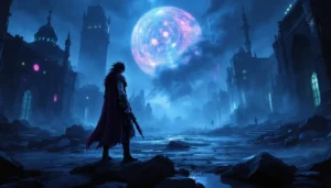
Recent mainline entries have continued refining this approach. Final Fantasy XV’s sleek, angular design used metallic effects and kingdom crests to convey political themes. Final Fantasy XVI’s logo strips away excess ornamentation in favor of neo-gothic inspired lettering, suggesting medieval brutality and high-stakes conflict. Each design choice reflects narrative DNA, the logos have become shorthand for thematic concerns before players even boot the game.
Spin-Offs And Franchise Logos
Final Fantasy XIV And The MMO Identity
When Final Fantasy XIV launched in 2010 and later rebooted as A Realm Reborn in 2013, the logo faced a unique challenge: it needed to function as both franchise icon and MMO identity system. Unlike single-player entries, an MMO logo must work across game client launchers, website headers, merchandise, esports broadcasts, and international markets simultaneously.
The XIV logo features a circular emblem, the Eorzean map integrated into a compass-like design, paired with sophisticated serif typography. This approach distinguishes XIV from numbered entries while maintaining clear Final Fantasy lineage. The circular element proved crucial for MMO conventions: it works at small icon sizes without losing integrity, crucial for UI design where logos appear at thumbnail scale.
As Final Fantasy XIV expanded through expansions, logo variations emerged for narrative storytelling. Heavensward’s logo incorporated dragon motifs reflecting the expansion’s focus. Shadowbringers introduced a darker, more intricate version signaling the story’s tonal shift toward apocalyptic themes. Endwalker’s logo design reflected cosmic scope with ethereal effects. These variations demonstrate sophisticated branding strategy, each expansion maintains XIV’s core identity while creating visual distinction, helping marketing teams, content creators, and players rapidly identify which era content belongs to.
The Final Fantasy XIV Archives on Ironharley documents how these visual identities have shaped community perception and esports branding, particularly as the game’s competitive PvP scene developed.
Side Series And Expanded Universe Branding
Final Fantasy’s expanded universe demanded logo systems that conveyed sub-franchise identity while maintaining parent-brand recognition. The Dissidia Final Fantasy series introduced logos blending iconic character silhouettes with geometric crystalline shapes, instantly communicating the game’s core premise of warriors from across Final Fantasy history converging in conflict.
Final Fantasy Type-0 developed a militaristic aesthetic reflected in its logo, angular, austere lettering suggesting the game’s warfare themes and its independence from traditional number-line entries. The design language shifted toward contemporary tactical games rather than classic JRPG presentation.
Final Fantasy XV’s extensive spin-off ecosystem (Kingsglaive film, Episode Duscae demo, DLC episodes) required supplementary logos that felt cohesive yet distinct. Each installment received typography and emblem treatment that reinforced the main game’s medieval-gothic aesthetic while creating hierarchical visual distinction.
Mobile entries like Final Fantasy Brave Exvius and Final Fantasy Record Keeper simplified logo design for touchscreen contexts, removing fine details and focusing on bold, scalable typography. These designs prioritize legibility on small screens and across diverse international markets where localization demands rapid visual recognition.
Spin-off branding also extends to collaborations. Final Fantasy VII Remake introduced a logo that explicitly called back the original’s iconic design while adding modern refinement, a visual conversation between eras that communicated respect for legacy alongside contemporary recreation.
The Crystal Symbol: Design Elements Across Logos
The crystal stands as Final Fantasy’s most persistent visual element, appearing across logos since the earliest entries. This isn’t accidental, it represents the metaphysical core of the series itself. From the original game’s four elemental crystals through XIV’s Mothercrystal in Eorzea, this symbol conveys narrative purpose: the idea that elemental magic, ancient power, and world-defining forces crystallize into physical form.
Designers have approached crystal integration differently depending on era and context. Early logos included simple geometric crystal shapes, often polygonal, sometimes incorporating elements of the series’ recurring themes (moogles, chocobos, summoned creatures). The crystal served simultaneously as visual anchor and narrative foreshadowing.
By the PlayStation era, crystal imagery became more sophisticated. Final Fantasy VIII and IX integrated crystalline effects into their logo treatments, using transparency, gradient, and refraction effects to suggest magical power. Final Fantasy XIV centralized crystal symbolism even further: the Aether and Primals of Eorzea orbit and dominate logo design. The crystal became less a decorative element and more a structural principle, other design elements arrange themselves in relation to the crystal form.
Recent entries have abstracted crystal symbolism further. Rather than depicting literal crystals, logos now incorporate crystalline properties, geometric lines suggesting structure and refraction, color gradients evoking light fracturing through prisms, angular shapes communicating hardness and permanence. This evolution reflects broader design trends: concrete imagery yields to stylized abstraction while maintaining symbolic resonance.
The crystal’s persistence demonstrates how successful franchise branding works. The symbol carries narrative weight, visual distinctiveness, and enough abstraction to adapt across wildly different game contexts, from dark knights and airships to post-apocalyptic wastelands to interconnected MMO worlds. Players recognize the crystal instantly, even when its specific context shifts.
Typography And Visual Consistency
Typography choices reveal Final Fantasy’s design philosophy across eras. The original NES logo used block lettering, readable, bold, unmistakable. This convention persisted for decades because it worked: typography alone could convey authority and fantasy grandeur simultaneously.
With technological advancement came geometric experimentation. The SNES era introduced rounded letters with decorative serifs, suggesting both elegance and high-fantasy convention. PS1 capabilities enabled dramatic effects: the VII logo’s metallic glow, the VIII logo’s intricate shadow work. These effects weren’t gratuitous, they communicated technological prowess, suggesting players would experience visuals beyond what was possible before.
Modern Final Fantasy typography has converged on neo-gothic and art-deco influenced designs. There’s deliberate rejection of the overly-decorated aesthetic of early 2000s gaming. Contemporary logos prioritize legibility while incorporating subtle decorative elements: slightly extended serifs, unusual letter spacing, geometric accents. This restraint reflects design maturity, the franchise no longer needs to prove its prestige through ornate presentation.
Consistency across spin-offs and merchandise presents ongoing design challenges. The font family must scale gracefully from business-card size to billboard scale, render clearly on television broadcasts and smartphone screens, and adapt across dozens of languages where character widths and heights vary dramatically. The solution has been developing modular typography: a core font family with systematic rules for proportional adjustment and color variation.
Internationalization particularly influences logo design. Final Fantasy XIV, as a global MMO, required logos that worked equally well in English, Japanese, Korean, Chinese, German, and French. The circular emblem approach solved this elegantly, the text portion could rotate or reposition while the geometric symbol remained constant. This design principle shaped XIV’s overall visual identity in ways that influenced subsequent franchise entries.
Color treatment deserves specific attention. Early Final Fantasy logos used practical color constraints, limited palettes determined by cartridge and printer limitations. As manufacturing improved, color became a storytelling tool. Dark blues suggest mystery and magic. Golds convey prestige. Reds indicate action and passion. Recent logos employ more complex palettes, but always with restraint. Final Fantasy XVI’s near-monochromatic approach demonstrates confidence: the logo needs no flashy colors, just refined typography and subtle texture work.
Cultural Impact And Merchandise Recognition
Final Fantasy logos have transcended gaming, becoming recognizable symbols in broader pop culture. The black and white Chocobo logo, the Final Fantasy VII meteor-Midgar symbol, and XIV’s compass emblem appear on clothing, collectibles, and merchandise worldwide. This visibility wasn’t inevitable, it resulted from careful branding decisions that prioritized simplicity and distinctiveness.
Merchandise constraints have directly influenced logo evolution. Designs that work beautifully on 1920×1080 displays often fail when screen-printed onto t-shirts or embroidered into hats. This practical concern shaped the industry-wide movement toward simpler, bolder logo treatments. Final Fantasy designers learned that ornate elements either become muddy at small scale or require expensive embroidery techniques.
Esports visibility has further shaped logo impact. As Final Fantasy 14 Live Letter announcements reach millions and Final Fantasy 14 Fan Fest events broadcast globally, logos appear constantly in broadcast graphics, stage design, and team branding. The XIV logo’s geometric flexibility proved ideal for esports contexts, it could be incorporated into team logos, broadcast graphics, and arena design without overwhelming other visual elements.
International merchandise reveals logo design sophistication. The same symbol needs to work in Japanese retail contexts (where minimalism is valued), Western gaming storefronts (where bold presence matters), and Asian markets with different aesthetic conventions. Logos that achieve this across multiple markets, like XIV’s emblem or XVI’s typography, demonstrate strategic thinking about visual communication that extends beyond the game itself.
Cosplay communities have also shaped logo recognition. When hundreds of thousands of fans recreate iconic costumes at events like PAX or Japan Expo, they wear logo-bearing apparel, display logo-emblazoned props, and discuss logo design choices. This grassroots amplification has made some Final Fantasy logos more recognizable than many corporate brand identities. The logos have become community property in the best sense, fans discuss design philosophy, recreate logos in various media, and incorporate them into fan art and original creations. This engagement validates the original design choices while creating self-reinforcing cycles where logo visibility increases investment in the franchise itself.
Various gaming journalism outlets, including Siliconera’s coverage of Final Fantasy announcements and Gematsu’s tracking of Japanese game releases, have documented how logo reveals generate community discussion. When Square Enix teases a new logo design, fan speculation about thematic implications spreads across social media. This demonstrates that logo design has evolved from simple brand identification into narrative foreshadowing and community engagement tool.
The RPG Site’s detailed JRPG coverage has also highlighted how Final Fantasy logos influence purchasing decisions and game discovery. Players browsing digital storefronts recognize Final Fantasy logos instantly, creating instant familiarity. This brand recognition translates directly to sales, a phenomenon that explains why Square Enix invests substantial resources into logo design and marketing rollout.
Conclusion
Final Fantasy logos represent something rare in gaming: visual artifacts that have remained consistently relevant across nearly four decades of technological transformation. From NES cartridges to 4K displays, from pixel art to motion capture cinematics, the franchise’s branding has adapted without losing its fundamental identity.
What makes these logos enduring isn’t complexity or innovation for its own sake. Instead, it’s the balance between consistency and evolution. The crystal symbol persists because it carries narrative weight. Typography adapts to new contexts while maintaining legibility and prestige. Color and decorative elements shift to reflect each game’s thematic concerns.
As the franchise looks toward future entries and platforms, whether VR experiences, cloud gaming, or technologies not yet invented, logo design will continue this pattern of thoughtful adaptation. The logos aren’t just brand identifiers: they’re visual language through which Final Fantasy communicates its themes, values, and evolution. For gamers encountering these logos across four decades, they represent a visual thread connecting every Final Fantasy experience, from the NES screen to whatever comes next.